


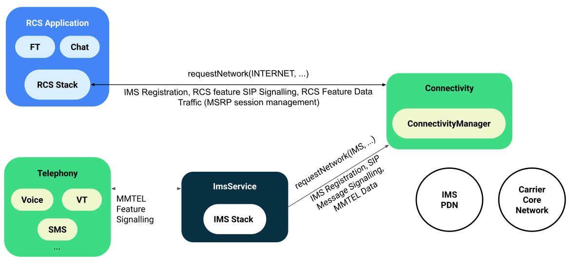


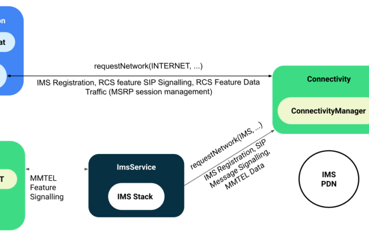


Bringing IMS functionality to Android: a gateway to advanced networking What is the role...
With technology integrated into our daily lives, understanding its aspects has become more of...
Introduction to Carrier Hub App Staying connected in the fast-paced world of mobile technology...
Introduction A genre that seamlessly marries the electrifying vibrations of electronic music with the...
Traditional approaches to supply chain management For years, managing the supply chain meant relying...
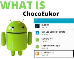
If you are an Android user, you may have seen the “ChocoEukor” app on...

introduction As we move deeper into the digital age, Companion Device Manager has become...
Web design, a pivotal element in today’s digital landscape, is more than just assembling...

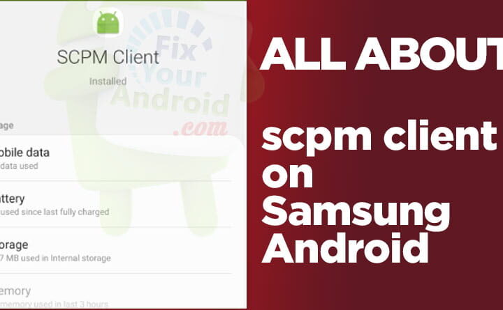
Hello, tech enthusiasts and gamers alike! Ever navigated the sometimes convoluted waters of mobile...

Hey there, tech enthusiasts! We know you’re always on the hunt for the latest...