When it comes to presenting a presentation, whether you’re trying to sell something, portray information and knowledge, or trying to connect with people, either within your business or your customers, it can be so difficult to keep people engaged with what you’re saying.
However, it doesn’t help if you’re using a slideshow which is simply crammed full of text and words. Instead, you’ll need to break everything up with pictures, and what better way is there to display information in picture form than graphs and charts.
To help you stay inspired, here are some of the best graphs and charts to use in your presentations.
#1 – A Column Graph
This is perhaps one of the most common types of graph, and if you’re looking to portray data in your presentation simply, this could be the best way to do so. This kind of graph is capable of displaying really basic sets of information, especially those with 1-3 data sets.
#2 – A Bar Graph
Extremely similar to a Colum Graph, a bar graph is basically the same except the data, and the bars are presented in a horizontal fashion, rather than vertically. Again, these graphs are best for information with less than three data points.
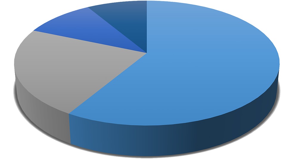
#3 – A Pie Chart
Another hugely popular and engagingly visual kind of graph is the pie chart. This helps your audience to see what proportion of data you’re talking about in regard to the whole data set. For example, you could have all the employees in your company, and then break down how they feel about a certain topic.
#4 – A Simple Table
If you have lots of information to portray to your audience for whatever reason, one of the most effective ways is through a basic grid table. However, this normally means you’ll be presenting your audience with lots of information, so make sure you’re providing copies, so everyone can see clearly and follow along.
#5 – A Line Graph
A line graph is a great way to display information that takes place over a certain amount of the time clearly. For example, you could count how many cars go past a certain spot within 24 hours. The bottom line of the graph would represent each hour.
You can also use as many lines as you want on a single graph, for example, demonstrating the colors of each car.
#6 – A Pictogram
A Pictogram is a fantastic way to display information in an extremely visual format. Instead of using numbers or a chart, you will use images. For example, you will more likely say 20% of people, but then display this information as two small, simple images of people, using ten in total to display all the information.
#7 – An AI Graph
AI graphs are a new form of a graph in which you can simply pick the style you want to work with, such as the graphs is described in this article, but artificial intelligence technology will point and plan the graph.
This means you can tell a story with your data using Beautiful.AI, which is far more engaging than a random type of graph that’s boring and basic.
#8 – A Cartesian Graph
A Cartesian graph is simply a term that describes a graph that doesn’t necessarily start at zero, but more likely plots coordinates anywhere onto a graph. This is ideal if you have a rather diverse range of results that you need to display.
Summary
As you can see, there are lots of different kinds of graph you can choose to work within your presentation. Where possible, it’s highly recommended that you implement one as it makes it far easier for you to convey information while keeping your audience’s attention.


More Stories
dji pocket 3 vs. Competitors: Which Gaming Console Reigns Supreme.
What Are the Most Common Sources of Waste in the Business World?
6 Tips for Designing the Perfect eCommerce Website